import pandas as pd
import matplotlib.pyplot as plt
import numpy as np
import mglearn
from IPython.display import ImageUnsupervised Learning
Book
This IPython notebook follows the book Introduction to Machine Learning with Python by Andreas Mueller and Sarah Guido and uses material from its github repository and from the working files of the training course Advanced Machine Learning with scikit-learn. Excerpts taken from the book are displayed in italic letters.
The contents of this Jupyter notebook corresponds in the book Introduction to Machine Learning with Python to:
- Chapter 3 “Unsupervised Learning and Preprocessing”: p. 131 to 147
- Chapter 3 “Unsupervised Learning and Preprocessing”: p. 168 to 187
Python
if 0:
    import warnings
    warnings.filterwarnings("ignore")
Scaling
is often part of preprocessing
Scaling methods don’t make use of the supervised information, making them unsupervised.
Goal: transform the data to more standard ranges
per feature methods:
- StandardScaler uses mean and variance
- RobustScaler uses median and quartiles
- MinMaxScaler uses min and max
per sample methods:
- Normalizer uses Euclidean length
Link: Feature Scaling with scikit-learn
mglearn.plots.plot_scaling()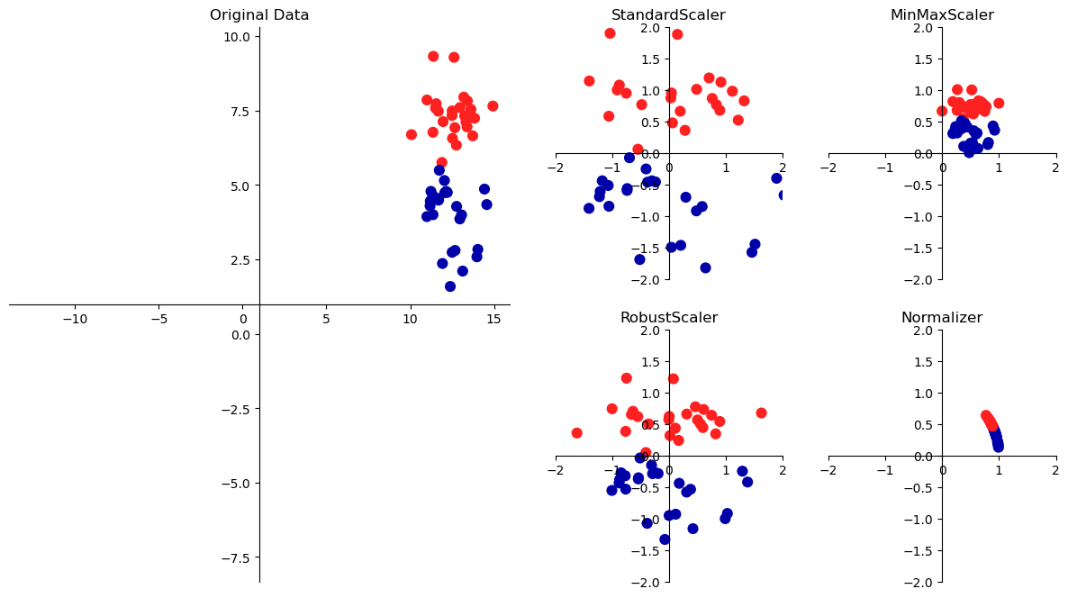
Applying scaling data transformations
from sklearn.datasets import load_breast_cancer
from sklearn.model_selection import train_test_split

cancer = load_breast_cancer()
X_train, X_test, y_train, y_test = train_test_split(cancer.data, cancer.target,
                                                    random_state=1)
print(X_train.shape)
print(X_test.shape)
(426, 30)
(143, 30)from sklearn.preprocessing import MinMaxScaler
scaler = MinMaxScaler()
scaler.fit(X_train) # fit the scaler, no scaling of data yetMinMaxScaler()In a Jupyter environment, please rerun this cell to show the HTML representation or trust the notebook.
On GitHub, the HTML representation is unable to render, please try loading this page with nbviewer.org.
MinMaxScaler()
# transform data using the fitted scaler:
X_train_scaled = scaler.transform(X_train)

# print dataset properties before and after scaling:
print(f"transformed shape: {X_train_scaled.shape}")
print(f"per-feature minimum before scaling:\n {X_train.min(axis=0)}")
print(f"per-feature maximum before scaling:\n {X_train.max(axis=0)}")
print(f"per-feature minimum after scaling:\n {X_train_scaled.min(axis=0)}")
print(f"per-feature maximum after scaling:\n {X_train_scaled.max(axis=0)}")
transformed shape: (426, 30)
per-feature minimum before scaling:
[6.981e+00 9.710e+00 4.379e+01 1.435e+02 5.263e-02 1.938e-02 0.000e+00
0.000e+00 1.060e-01 5.024e-02 1.153e-01 3.602e-01 7.570e-01 6.802e+00
1.713e-03 2.252e-03 0.000e+00 0.000e+00 9.539e-03 8.948e-04 7.930e+00
1.202e+01 5.041e+01 1.852e+02 7.117e-02 2.729e-02 0.000e+00 0.000e+00
1.566e-01 5.521e-02]
per-feature maximum before scaling:
[2.811e+01 3.928e+01 1.885e+02 2.501e+03 1.634e-01 2.867e-01 4.268e-01
2.012e-01 3.040e-01 9.575e-02 2.873e+00 4.885e+00 2.198e+01 5.422e+02
3.113e-02 1.354e-01 3.960e-01 5.279e-02 6.146e-02 2.984e-02 3.604e+01
4.954e+01 2.512e+02 4.254e+03 2.226e-01 9.379e-01 1.170e+00 2.910e-01
5.774e-01 1.486e-01]
per-feature minimum after scaling:
[0. 0. 0. 0. 0. 0. 0. 0. 0. 0. 0. 0. 0. 0. 0. 0. 0. 0. 0. 0. 0. 0. 0. 0.
0. 0. 0. 0. 0. 0.]
per-feature maximum after scaling:
[1. 1. 1. 1. 1. 1. 1. 1. 1. 1. 1. 1. 1. 1. 1. 1. 1. 1. 1. 1. 1. 1. 1. 1.
1. 1. 1. 1. 1. 1.]# transform test data using the same scaler:
X_test_scaled = scaler.transform(X_test)
# print test data properties after scaling
print(f"per-feature minimum after scaling:\n{X_test_scaled.min(axis=0)}")
print(f"per-feature maximum after scaling:\n{X_test_scaled.max(axis=0)}")per-feature minimum after scaling:
[ 0.0336031 0.0226581 0.03144219 0.01141039 0.14128374 0.04406704
0. 0. 0.1540404 -0.00615249 -0.00137796 0.00594501
0.00430665 0.00079567 0.03919502 0.0112206 0. 0.
-0.03191387 0.00664013 0.02660975 0.05810235 0.02031974 0.00943767
0.1094235 0.02637792 0. 0. -0.00023764 -0.00182032]
per-feature maximum after scaling:
[0.9578778 0.81501522 0.95577362 0.89353128 0.81132075 1.21958701
0.87956888 0.9333996 0.93232323 1.0371347 0.42669616 0.49765736
0.44117231 0.28371044 0.48703131 0.73863671 0.76717172 0.62928585
1.33685792 0.39057253 0.89612238 0.79317697 0.84859804 0.74488793
0.9154725 1.13188961 1.07008547 0.92371134 1.20532319 1.63068851]Scaling training and test data the same way!
from sklearn.datasets import make_blobs

# make synthetic data
X, _ = make_blobs(n_samples=50, centers=5, random_state=4, cluster_std=2)

# split it into training and test set
X_train, X_test = train_test_split(X, random_state=5, test_size=.1)

fig, axes = plt.subplots(1, 3, figsize=(13, 4))
# plot the training and test set
axes[0].scatter(X_train[:, 0], X_train[:, 1],
                c='b', label="Training set", s=60)
axes[0].scatter(X_test[:, 0], X_test[:, 1], marker='^',
                c='r', label="Test set", s=60)
axes[0].legend(loc='upper left')
axes[0].set_title("Original Data")
axes[0].grid(True)

# scale the data using MinMaxScaler
scaler = MinMaxScaler()
scaler.fit(X_train)
X_train_scaled = scaler.transform(X_train)
X_test_scaled  = scaler.transform(X_test)

# visualize the properly scaled data
axes[1].scatter(X_train_scaled[:, 0], X_train_scaled[:, 1],
                c='b', label="Training set", s=60)
axes[1].scatter(X_test_scaled[:, 0], X_test_scaled[:, 1], marker='^',
                c='r', label="Test set", s=60)
axes[1].set_title("Scaled Data")
axes[1].grid(True)

# rescale the test set separately
# so that test set min is 0 and test set max is 1
# DO NOT DO THIS! For illustration purposes only
test_scaler = MinMaxScaler()
test_scaler.fit(X_test)
X_test_scaled_badly = test_scaler.transform(X_test)

# visualize wrongly scaled data
axes[2].scatter(X_train_scaled[:, 0], X_train_scaled[:, 1],
                c='b', label="training set", s=60)
axes[2].scatter(X_test_scaled_badly[:, 0], X_test_scaled_badly[:, 1],
                marker='^', c='r', label="test set", s=60)
axes[2].set_title("Improperly Scaled Data")
axes[2].grid(True)

for ax in axes:
    ax.set_xlabel("Feature 0")
    ax.set_ylabel("Feature 1")
fig.tight_layout()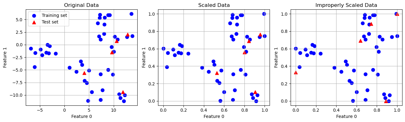
The effect of scaling on supervised learning
X_train, X_test, y_train, y_test = train_test_split(cancer.data, cancer.target,
                                                    random_state=0)

# learning on the scaled training data
from sklearn.neighbors    import KNeighborsClassifier
from sklearn.linear_model import LogisticRegression
from sklearn.tree         import DecisionTreeClassifier

clf = KNeighborsClassifier(n_neighbors=3)
# clf = LogisticRegression(max_iter=5000)
# clf = DecisionTreeClassifier(max_depth=2, random_state=0)

clf.fit(X_train, y_train)

# scoring on the unscaled test set
print(f"Test set accuracy: {clf.score(X_test, y_test):.5f}")
Test set accuracy: 0.92308# preprocessing using MinMaxScaler
scaler = MinMaxScaler()
scaler.fit(X_train)
X_train_scaled = scaler.transform(X_train)
X_test_scaled = scaler.transform(X_test)
# learning on the scaled training data
clf.fit(X_train_scaled, y_train)
# scoring on the scaled test set
print(f"Scaled test set accuracy: {clf.score(X_test_scaled, y_test):.5f}")Scaled test set accuracy: 0.95105# preprocessing using other scalers
from sklearn.preprocessing import StandardScaler
from sklearn.preprocessing import RobustScaler
from sklearn.preprocessing import Normalizer
scaler = StandardScaler()
# scaler = RobustScaler()
# scaler = Normalizer()
scaler.fit(X_train)
X_train_scaled = scaler.transform(X_train)
X_test_scaled = scaler.transform(X_test)
# learning on the scaled training data
clf.fit(X_train_scaled, y_train)
# scoring on the scaled test set
print(f"Scaled test set accuracy: {clf.score(X_test_scaled, y_test):.5f}")Scaled test set accuracy: 0.94406Principal Component Analysis (PCA)
Motivations:
- dimensionality reduction
- visualization
- compressing the data
- feature extraction
Here we study only Principal Component Analysis (PCA). Other algorithms are
- non-negative matrix factorization (NMF)
- independent component analysis (ICA)
- factor analysis (FA)
- sparse coding (dictionary learning)
- manifold learning with t-SNE
- etc.
Principal component analysis is a method that rotates the dataset in a way such that the rotated features are statistically uncorrelated, meaning that the correlation matrix of the data in this representation is zero except for the diagonal. This rotation is often followed by selecting only a subset of the new features, according to how important they are for explaining the data.
mglearn.plots.plot_pca_illustration()
Example: Applying PCA to the cancer dataset for visualization
fig, axes = plt.subplots(15, 2, figsize=(10, 25))
malignant = cancer.data[cancer.target == 0]
benign    = cancer.data[cancer.target == 1]

ax = axes.ravel()

for i in range(30):
    _, bins = np.histogram(cancer.data[:, i], bins=50)
    ax[i].hist(malignant[:, i], bins=bins, color=mglearn.cm3(0), alpha=.5)
    ax[i].hist(benign[:, i]   , bins=bins, color=mglearn.cm3(2), alpha=.5)
    ax[i].set_title(cancer.feature_names[i])
    ax[i].set_yticks(())
ax[0].set_xlabel("Feature magnitude")
ax[0].set_ylabel("Frequency")
ax[0].legend(["malignant", "benign"], loc="best")
fig.tight_layout()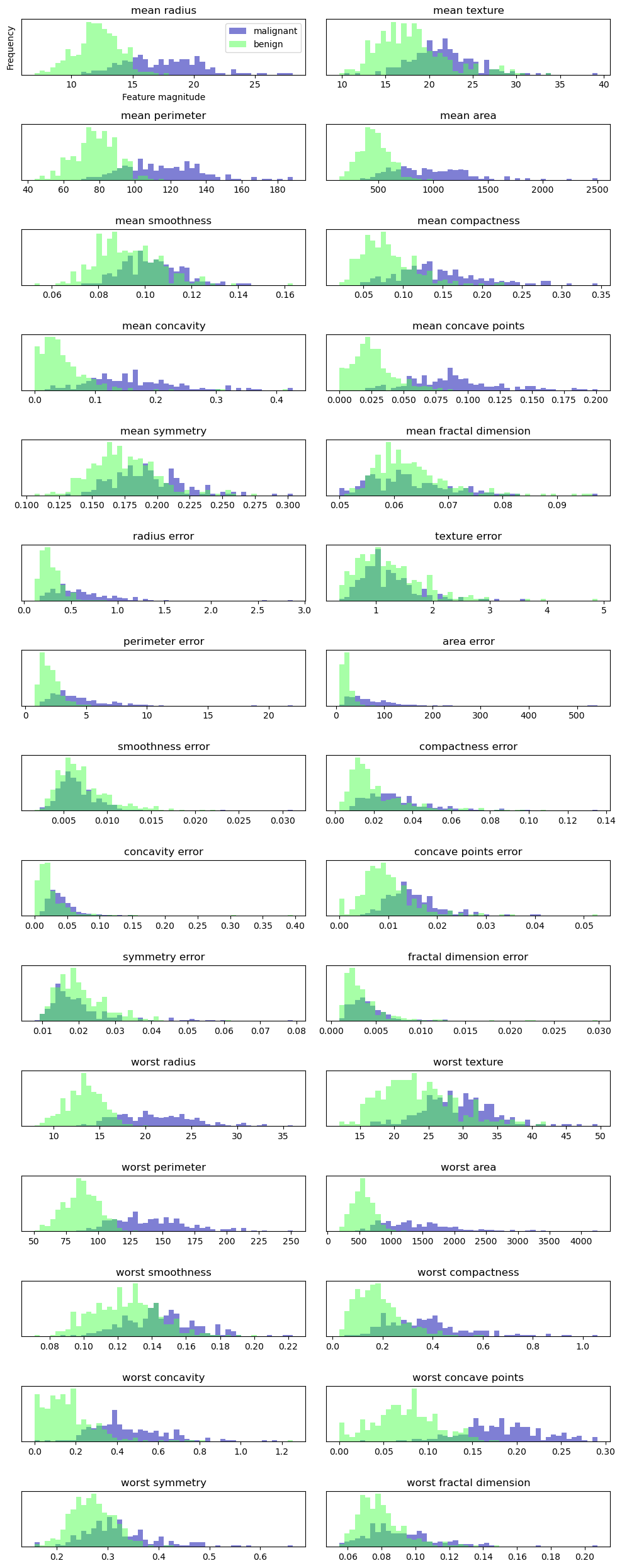
However, this plot doesn’t show us anything about the interactions between variables and how these relate to the classes. Using PCA, we can capture the main interactions and get a slightly more complete picture. We can find the first two principal components, and visualize the data in this new two-dimensional space with a single scatter plot.
scaler = StandardScaler()
scaler.fit(cancer.data)
X_scaled = scaler.transform(cancer.data)
from sklearn.decomposition import PCA
# keep the first two principal components of the data
pca = PCA(n_components=2)
# fit PCA model to breast cancer data
pca.fit(X_scaled)
# transform data onto the first two principal components
X_pca = pca.transform(X_scaled)
print(f"Original shape: {X_scaled.shape}")
print(f"Reduced shape : {X_pca.shape}")Original shape: (569, 30)
Reduced shape : (569, 2)# plot fist vs second principal component, color by class
plt.figure(figsize=(8, 8))
mglearn.discrete_scatter(X_pca[:, 0], X_pca[:, 1], cancer.target)
plt.legend(cancer.target_names, loc="best")
plt.gca().set_aspect("equal")
plt.xlabel("First principal component")
plt.ylabel("Second principal component")
plt.grid(True)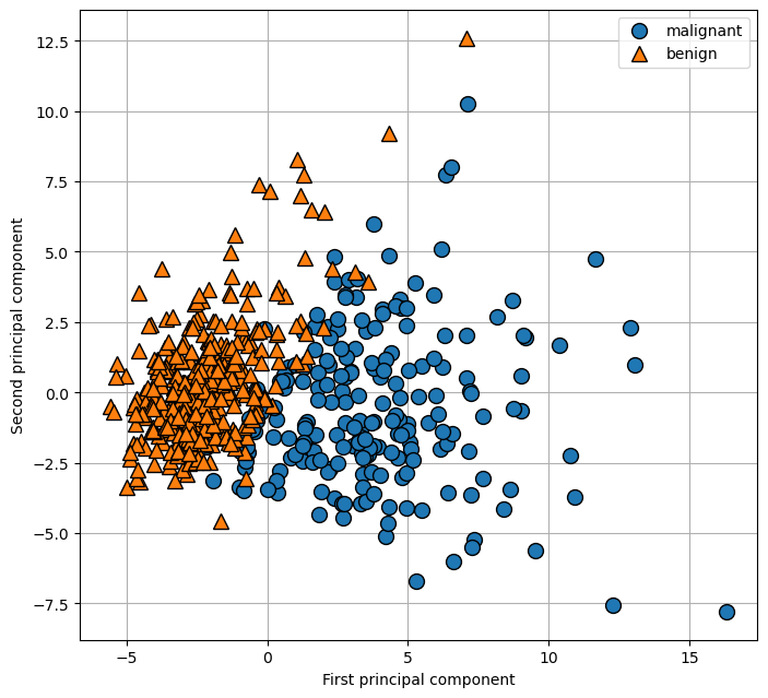
print(f"PCA component shape: {pca.components_.shape}")PCA component shape: (2, 30)pca.components_array([[ 0.21890244, 0.10372458, 0.22753729, 0.22099499, 0.14258969,
0.23928535, 0.25840048, 0.26085376, 0.13816696, 0.06436335,
0.20597878, 0.01742803, 0.21132592, 0.20286964, 0.01453145,
0.17039345, 0.15358979, 0.1834174 , 0.04249842, 0.10256832,
0.22799663, 0.10446933, 0.23663968, 0.22487053, 0.12795256,
0.21009588, 0.22876753, 0.25088597, 0.12290456, 0.13178394],
[-0.23385713, -0.05970609, -0.21518136, -0.23107671, 0.18611302,
0.15189161, 0.06016536, -0.0347675 , 0.19034877, 0.36657547,
-0.10555215, 0.08997968, -0.08945723, -0.15229263, 0.20443045,
0.2327159 , 0.19720728, 0.13032156, 0.183848 , 0.28009203,
-0.21986638, -0.0454673 , -0.19987843, -0.21935186, 0.17230435,
0.14359317, 0.09796411, -0.00825724, 0.14188335, 0.27533947]])plt.matshow(pca.components_, cmap='viridis')
plt.yticks([0, 1], ["First component", "Second component"])
plt.colorbar()
plt.xticks(range(len(cancer.feature_names)), cancer.feature_names, rotation=60, ha='left')
plt.xlabel("Feature")
plt.ylabel("Principal components");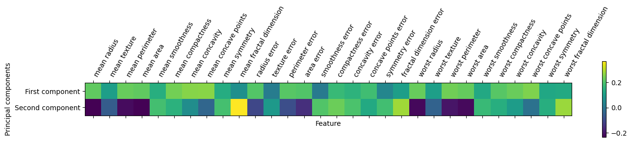
Example: Eigenfaces for feature extraction
See in the book Introduction to Machine Learning with Python by Andreas Mueller and Sarah Guido.
Clustering
Definition of Clustering:
Clustering is the task of partitioning a dataset into groups, called clusters. The goal is to split up the data in such a way that points within a single cluster are very similar and points in different clusters are different.
Nutzen:
- Strukur eines Datensatzes erkennen
- automatisierte Zuordnung zu Clustern
- typische Repräsentaten generieren
- neue Features generieren
- Einzelvorhersagemodelle pro Cluster statt ein Modell für den gesamten Datensatz
- etc.
k-Means Clustering
- Wähle Anzahl \(k\) an Clustern.
- Initialisiere zufällig \(k\) Clusterzentren im Featureraum.
- Ordne jedem Datenpunkt (Zeile in der \(X\)-Matrix) das ihm nächste Clusterzentrum zu.
- Update jedes Clusterzentrum durch den Mittelwert aller ihm zugeordneten Datenpunkte.
- Wiederhole die letzten zwei Schritte, bis sich die Clusterzentren nicht mehr ändern.
mglearn.plots.plot_kmeans_algorithm()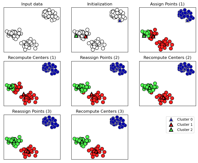
Ein neuer Datenpunkt wird dem ihm am nächsten Clusterzentrum zugeordnet.
mglearn.plots.plot_kmeans_boundaries()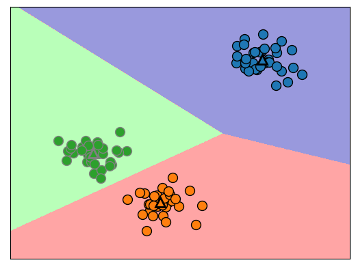
Code-Syntax
# generate synthetic two-dimensional data
from sklearn.datasets import make_blobs

X, y = make_blobs(random_state=1)

plt.scatter(X[:, 0], X[:, 1]);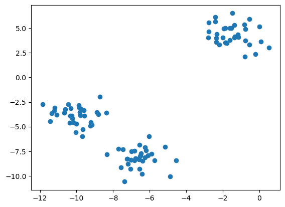
# build the clustering model:
from sklearn.cluster  import KMeans

kmeans = KMeans(n_clusters=3, n_init='auto')

kmeans.fit(X)
KMeans(n_clusters=3, n_init='auto')In a Jupyter environment, please rerun this cell to show the HTML representation or trust the notebook.
On GitHub, the HTML representation is unable to render, please try loading this page with nbviewer.org.
KMeans(n_clusters=3, n_init='auto')
# assigned cluster labels:
print(kmeans.labels_)

# plot data with labels together with cluster centers:
plt.plot(X[:, 0], X[:, 1], ".")
for k in range(len(kmeans.labels_)):
    plt.text(X[k, 0], X[k, 1], str(kmeans.labels_[k]))
plt.plot(kmeans.cluster_centers_[:, 0], kmeans.cluster_centers_[:, 1],
         'o', markersize=12)
plt.grid(True)
[0 2 2 2 1 1 1 2 0 0 2 2 1 0 1 1 1 0 2 2 1 2 1 0 2 1 1 0 0 1 0 0 1 0 2 1 2
2 2 1 1 2 0 2 2 1 0 0 0 0 2 1 1 1 0 1 2 2 0 0 2 1 1 2 2 1 0 1 0 2 2 2 1 0
0 2 1 1 0 2 0 2 2 1 0 0 0 0 2 0 1 0 0 2 2 1 1 0 1 0]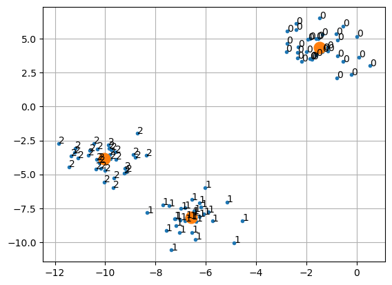
# predict label of new data point:
X_new = np.array([[-2,  0],
                  [-8, -1]])
kmeans.predict(X_new)
array([0, 2], dtype=int32)Note: Running the algorithm again might result in a different numbering of clusters because of the random nature of the initialization.
kmeans.fit(X)
print(kmeans.labels_)
[1 2 2 2 0 0 0 2 1 1 2 2 0 1 0 0 0 1 2 2 0 2 0 1 2 0 0 1 1 0 1 1 0 1 2 0 2
2 2 0 0 2 1 2 2 0 1 1 1 1 2 0 0 0 1 0 2 2 1 1 2 0 0 2 2 0 1 0 1 2 2 2 0 1
1 2 0 0 1 2 1 2 2 0 1 1 1 1 2 1 0 1 1 2 2 0 0 1 0 1]Examples
Unterschiedliche Vorgabe der Anzahl von Clusterzentren:
plt.figure(figsize=(10, 5))

# using two cluster centers:
n = 2
plt.subplot(1, 2, 1)
kmeans = KMeans(n_clusters=n, n_init='auto')
kmeans.fit(X)
mglearn.discrete_scatter(X[:, 0], X[:, 1], kmeans.labels_)
plt.title("{:} clusters".format(n))

# using five cluster centers:
n = 5
plt.subplot(1, 2, 2)
kmeans = KMeans(n_clusters=n, n_init='auto')
kmeans.fit(X)
mglearn.discrete_scatter(X[:, 0], X[:, 1], kmeans.labels_)
plt.title("{:} clusters".format(n));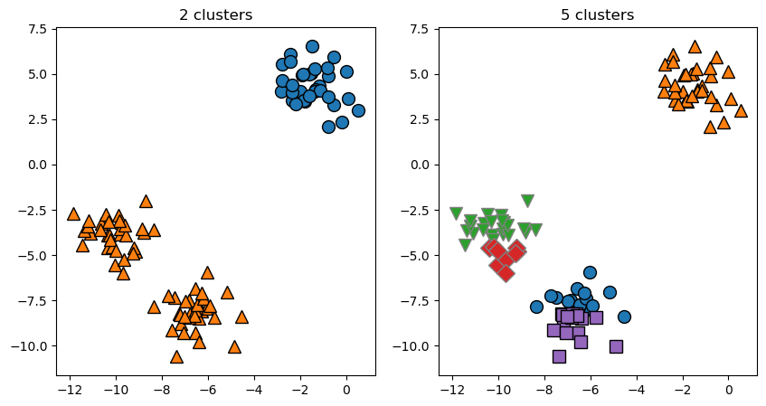
Each cluster is defined solely by its center, and not, for example, by density of data points.
X_varied, y_varied = make_blobs(n_samples=200,
                                cluster_std=[1.0, 2.5, 0.5],
                                random_state=170)
kmeans = KMeans(n_clusters=3, random_state=0, n_init='auto')
y_pred = kmeans.fit_predict(X_varied)

mglearn.discrete_scatter(X_varied[:, 0], X_varied[:, 1], y_pred)
plt.plot(kmeans.cluster_centers_[:, 0], kmeans.cluster_centers_[:, 1], 'o', markersize=12, color='black')
plt.legend(["cluster 0", "cluster 1", "cluster 2"], loc='best')
plt.xlabel("Feature 0")
plt.ylabel("Feature 1");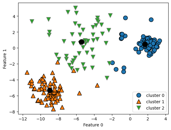
K-Means also assumes that all directions are equally important for each cluster.
# generate some random cluster data
X, y = make_blobs(random_state=170, n_samples=600)
rng = np.random.RandomState(74)

# transform the data to be streched
transformation = rng.normal(size=(2, 2))
X = np.dot(X, transformation)

# cluster the data into three clusters
kmeans = KMeans(n_clusters=3, n_init='auto')
kmeans.fit(X)
y_pred = kmeans.predict(X)

# plot the cluster assignments and cluster centers
mglearn.discrete_scatter(X[:, 0], X[:, 1], kmeans.labels_, markers='o')
plt.plot(kmeans.cluster_centers_[:, 0], kmeans.cluster_centers_[:, 1], 'o', markersize=12, color='black')
plt.xlabel("Feature 0")
plt.ylabel("Feature 1");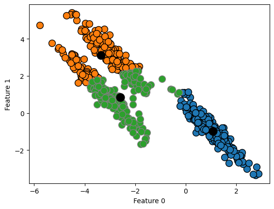
Zwei Monde:
# generate synthetic two_moons data (with less noise this time)
from sklearn.datasets import make_moons

X, y = make_moons(n_samples=200, noise=0.05, random_state=0)

# cluster the data into two clusters
kmeans = KMeans(n_clusters=2, n_init='auto')
kmeans.fit(X)
y_pred = kmeans.predict(X)

# plot the cluster assignments and cluster centers
plt.scatter(X[:, 0], X[:, 1], c=y_pred, cmap=mglearn.cm2, s=60)
plt.scatter(kmeans.cluster_centers_[:, 0], kmeans.cluster_centers_[:, 1],
            marker='^', c=[mglearn.cm2(0), mglearn.cm2(1)], s=100, linewidth=2)
plt.xlabel("Feature 0")
plt.ylabel("Feature 1");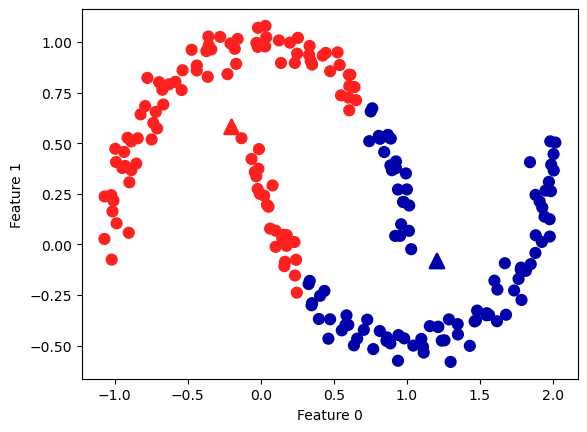
Vector Quantization - Or Seeing k-Means as Decomposition:
See in the book Introduction to Machine Learning with Python by Andreas Mueller and Sarah Guido.
Generating new Features
Die Clusterzugehörigkeit und die Distanzen zu den Clusterzentren können als zusätzliche Features verwendet werden.
X, y = make_moons(n_samples=200, noise=0.05, random_state=0)

kmeans = KMeans(n_clusters=10, random_state=0, n_init='auto')
kmeans.fit(X)
y_pred = kmeans.predict(X)

plt.scatter(X[:, 0], X[:, 1], c=y_pred, s=60, cmap='Paired')
plt.xlabel("Feature 0")
plt.ylabel("Feature 1")
print(f"Cluster memberships:\n{y_pred}")
Cluster memberships:
[2 3 4 0 3 3 2 9 2 9 8 1 3 9 8 2 7 1 7 8 6 9 5 9 5 4 3 6 4 5 2 5 9 4 7 6 1
2 0 4 1 8 7 4 3 8 2 8 4 9 8 1 6 0 9 7 7 9 5 5 1 0 3 2 9 0 5 3 5 0 1 0 1 4
1 0 4 2 7 1 6 5 1 6 4 8 2 8 1 6 7 2 6 8 6 3 3 1 0 4 9 6 5 2 0 4 0 8 3 5 8
5 5 0 2 9 7 6 1 2 2 8 4 5 4 8 2 4 9 6 2 8 0 4 9 3 9 0 6 2 4 4 7 8 8 2 4 9
5 4 1 3 2 7 1 5 9 1 7 7 4 9 7 3 1 3 7 1 3 9 7 0 0 0 4 9 6 8 8 7 3 0 6 3 6
7 5 1 0 8 0 7 2 2 4 8 6 4 5 3]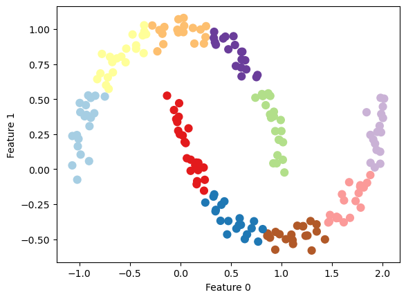
distance_features = kmeans.transform(X)
print(f"Distance feature shape: {distance_features.shape}")
print(f"Distance features:\n{distance_features}")
Distance feature shape: (200, 10)
Distance features:
[[1.77649215 0.9285066 0.23340263 ... 0.41421232 1.41852969 1.04013486]
[2.65715529 1.0972352 0.98271691 ... 1.62059711 2.49155556 0.4935202 ]
[0.92664672 0.83342655 0.94399739 ... 0.78354334 0.76615823 1.37288227]
...
[1.167158 0.49304961 0.81205971 ... 0.90687182 1.10492288 1.06309851]
[1.27806925 1.42316347 1.05774337 ... 0.44964618 0.72618023 1.78881986]
[2.62368174 1.10826107 0.88166689 ... 1.50992097 2.42366993 0.54671574]]Agglomerative Clustering
Agglomerative clustering refers to a collection of clustering algorithms that all build upon the same principles: the algorithm starts by declaring each point its own cluster, and then merges the two most similar clusters until some stopping criterion is satisfied. The stopping criterion implemented in scikit-learn is the number of clusters, so similar clusters are merged until only the specified number of clusters are left.
The following three criteria to specify how the “most similar cluster” is measured are implemented in scikit-learn:
ward: The default choice, ward picks the two clusters to merge such that the total variance within all clusters increases the least.average: average linkage merges the two clusters that have the smallest average distance between all their points.complete: complete linkage (also known as maximum linkage) merges the two clusters that have the smallest maximum distance between their points.
mglearn.plots.plot_agglomerative_algorithm()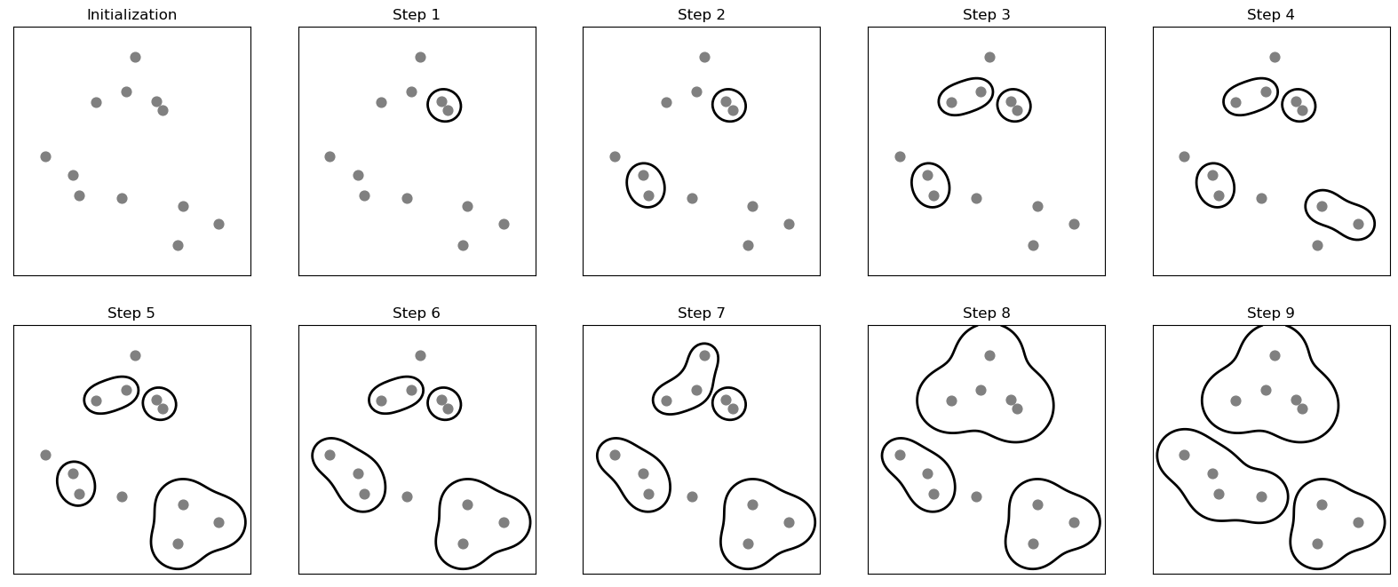
Code-Syntax
Because of the way the algorithm works, agglomerative clustering cannot make predictions for new data points. Therefore, Agglomerative Clustering has no predict method.
from sklearn.cluster import AgglomerativeClustering
X, y = make_blobs(random_state=1)

n = 3  # try different numbers of clusters
agg = AgglomerativeClustering(n_clusters=n, linkage='ward')
assignment = agg.fit_predict(X)

mglearn.discrete_scatter(X[:, 0], X[:, 1], assignment)
plt.legend(["Cluster 0", "Cluster 1", "Cluster 2"], loc="best")
plt.xlabel("Feature 0")
plt.ylabel("Feature 1");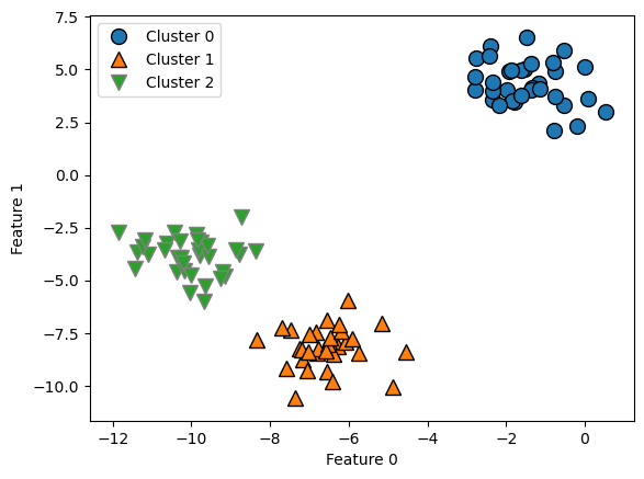
Dendrograms
# import the dendrogram function and the ward clustering function from SciPy
from scipy.cluster.hierarchy import dendrogram, ward

X, y = make_blobs(random_state=0, n_samples=12)

plt.scatter(X[:, 0], X[:, 1], s=50)
for i in range(12):
    plt.gca().annotate(str(i), xy=(X[i, 0], X[i, 1]))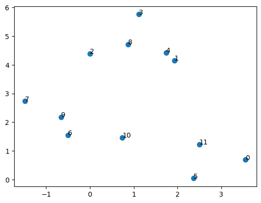
# apply the ward clustering to the data array X
# The SciPy ward function returns an array that specifies the distances
# bridged when performing agglomerative clustering
linkage_array = ward(X)

# now we plot the dendrogram for the linkage_array containing the distances
# between clusters
dendrogram(linkage_array)

# mark the cuts in the tree that signify two or three clusters
ax = plt.gca()
bounds = ax.get_xbound()
ax.plot(bounds, [7.25, 7.25], '--', c='k')
ax.plot(bounds, [4, 4], '--', c='k')
ax.text(bounds[1], 7.25, ' two clusters', va='center', fontdict={'size': 15})
ax.text(bounds[1], 4, ' three clusters', va='center', fontdict={'size': 15})
plt.xlabel("Sample index")
plt.ylabel("Cluster distance");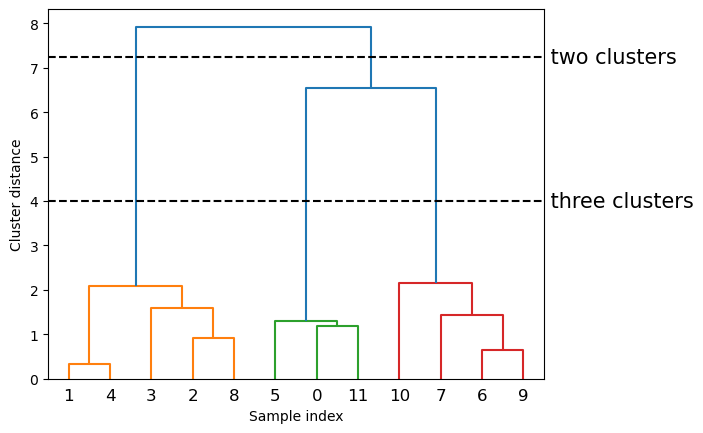
The y-axis in the dendrogram doesn’t just specify when in the agglomerative algorithm two clusters get merged. The length of each branch also shows how far apart the merged clusters are. The longest branches in this dendrogram are the three lines that are marked by the dashed line labeled “three clusters.” That these are the longest branches indicates that going from three to two clusters meant merging some very far-apart points.